
Project Details
Opportunity
The original website struggled to capture attention or communicate the brand’s value. Its meek, overly minimalist design left pages looking sparse and underdeveloped. Poor contrast and muted visuals made it difficult for users to engage with content, while inconsistent branding introduced visual accessibility issues that risked alienating key audiences. Instead of supporting credibility and alignment, the site’s design created friction, diluted the message, and failed to reflect the professionalism and energy of the organization.
Goals
Communicate the Brand More Effectively – Ensure the site reflects the organization’s values, professionalism, and unique positioning.
Improve Visual Accessibility – Resolve contrast and readability issues with a design system that meets accessibility standards and supports all users.
Enhance the Design Aesthetic – Create a modern, engaging, and cohesive look that instills trust and encourages deeper exploration.
Increase Search Visibility & Lead Generation – Optimize site structure, content, and SEO fundamentals to attract more visitors and convert them into business opportunities.
Solution
To maximize impact on a lean budget, we consolidated all three client websites into a single WordPress Multisite (MU) instance. This streamlined management by centralizing logins, updates, and security, while also lowering hosting costs.
We refreshed the brand to be more visually accessible, addressing low contrast and readability issues with an updated design system. To eliminate performance drag, we removed heavy theme and CMS builder bloat (Divi) and rebuilt on the lightweight, high-performing GeneratePress theme.
The results were immediate and measurable. SEO and site performance scores improved across the board, with Google Lighthouse Accessibility jumping from 60 to 92 and SEO climbing from 65 to 100. The redesign not only elevated the brand experience but also set the foundation for long-term growth with faster performance, stronger accessibility, and improved discoverability.
Result
The redesign and migration delivered both immediate improvements and long-term value:
Hosting Savings – Consolidating three separate sites into a single WordPress MU instance reduced hosting costs and simplified ongoing management.
Centralized Management – One login and admin panel now gives the client control over all sites, making updates, security, and content changes faster and more efficient.
Accessibility Improvements – Google Lighthouse Accessibility score increased from 60 → 92, ensuring a more inclusive and user-friendly experience.
SEO Optimization – SEO score improved from 65 → 100, boosting search visibility and discoverability.
Traffic Growth – Organic traffic increased by 30%, driving more visitors and qualified leads to the site.
Performance Gains – Replacing Divi with the GeneratePress theme removed unnecessary bloat, improving site speed, responsiveness, and stability.
In this case study, we showcase how thoughtful UX strategy and precise web development come together to create a seamless digital experience. From early discovery and design alignment through to the technical buildout, our process transformed complex requirements into a clean, scalable, and user-focused website. The result: a platform that not only looks great but works effortlessly—delivering clarity, functionality, and measurable impact for the client.
Process
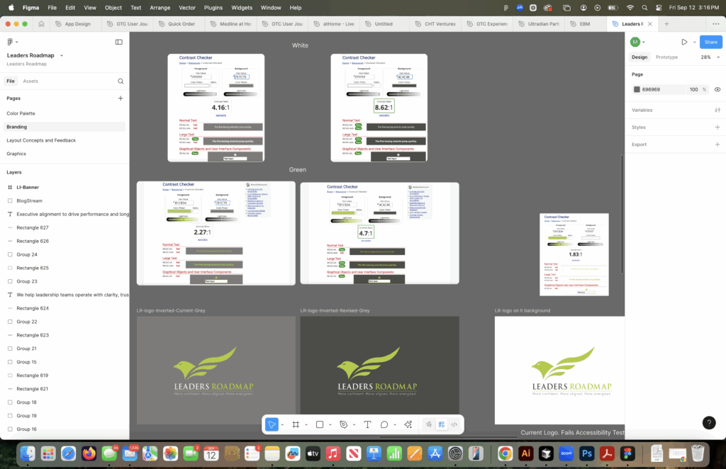
Accessibility Audit
As part of the redesign process, we conducted a full accessibility audit to identify barriers to usability. The audit revealed several critical issues with color contrast across the brand palette. For example, certain green-on-gray and white-on-gray combinations failed WCAG standards for normal text, making content difficult to read for many users.
By addressing these issues—refining the color system, improving contrast ratios, and testing against accessibility benchmarks—we ensured the new design not only looks modern and cohesive but is also inclusive and compliant with accessibility best practices. The results were measurable: our Google Lighthouse Accessibility score improved from 60 to 92, creating a stronger experience for all users.
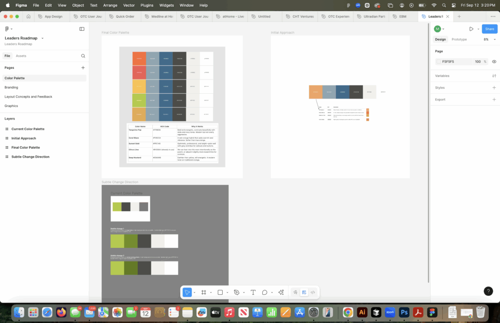
Logo and Color Palette Enhancement
As part of the redesign, we refined the brand color palette to resolve accessibility issues and modernize the overall look. The original greens and grays lacked sufficient contrast, creating readability challenges and limiting flexibility in application. Through iterative testing in Figma, we introduced a refreshed palette anchored by high-contrast tones and complementary accent colors.
The updated system not only elevated the logo’s visual impact but also provided a more versatile design foundation across the website. Most importantly, the new palette passed accessibility checks, ensuring the brand can communicate with clarity and inclusivity while maintaining its distinct identity.
Outcomes & Metrics
The redesign and migration delivered both immediate improvements and long-term value:
Hosting Savings – Consolidating three separate sites into a single WordPress MU instance reduced hosting costs and simplified ongoing management.
Centralized Management – One login and admin panel now gives the client control over all sites, making updates, security, and content changes faster and more efficient.
Accessibility Improvements – Google Lighthouse Accessibility score increased from 60 → 92, ensuring a more inclusive and user-friendly experience.
SEO Optimization – SEO score improved from 65 → 100, boosting search visibility and discoverability.
Traffic Growth – Organic traffic increased by 30%, driving more visitors and qualified leads to the site.
Performance Gains – Replacing Divi with the GeneratePress theme removed unnecessary bloat, improving site speed, responsiveness, and stability.
Lessons Learned
This project underscored the value of clarity and preparation. One key takeaway is the importance of having a business agreement in place up front, ensuring expectations around scope, workload, and deliverables are clearly defined. Another lesson was to thoroughly research all plugins and technical dependencies in a client’s existing environment before committing to a migration—even a “free” one. This step is critical to avoid unexpected conflicts, compatibility issues, or hidden complexities that can add significant time to the project.
Despite these challenges, the collaboration with the client was exceptional. They were engaged, supportive, and open to creative solutions. The experience ultimately benefited both sides: the client gained a more robust, accessible, and cost-efficient digital platform, while we gained valuable insights to strengthen our processes and partnerships moving forward.